The Windows Phone 7 Series UI Design and Interaction Guide is available for download as a PDF from from microsoft.com here.
From the introduction:
The Windows® Phone 7 Series CTP User Interface (UI) is based off a Windows Phone design system internally codenamed “Metro.” The Metro design principles center on a look that uses type to echo the visual language of airport and metro system signage. The goal is to clearly direct end users to the content they want. Metro interfaces are supposed to embody harmonious, functional, and attractive visual elements. Ideally, good UI design should encourage playful exploration when interacting with the application and people should feel a sense of wonder and excitement. A clear, straightforward design not only makes an application legible, it encourages usage. This guide will provide design knowledge and fundamentals for this type of UI development. We highly recommend that developers adopt the Metro design style whenever possible. Although requirements may vary based on the application, paralleling this experience will create a more consistent, fluid UI experience from the custom and built-in application view.
This guide will also detail several possible methods of interaction that can be used by a Windows Phone 7 Series CTP application, including standard input, functionality within the UI framework, and the Metro-themed Silverlight® and system-based controls. By understanding and incorporating key design concepts and considerations within these areas, you can craft your application to provide a better end user experience. You will also have a deeper understanding of the number of different hardware and software interaction elements that are available to developers in Windows Phone 7 Series CTP. Diverging from the Windows Phone 7 Series CTP interaction model is generally not allowed. However, there are a few exceptions where the UI behavior is different as application requirements vary.
The guide has 69 pages of prescriptive guidance on how to design great Windows Phone applications. It’s a preview of the final documentation, so expect tweaks over time, and please give us feedback by sending mail to [email protected]. We will monitor that mailbox regularly, but please do not expect responses. If you want to discuss the design or guidelines please head to the Windows Phone developer forums here.
Предыдущая часть
Инструменты для создания приложений
При установке Windows Phone Developer Tools вы получаете следующие бесплатные инструменты и компоненты.
- Expression Blend for Windows Phone
- Visual Studio 2010 Express for Windows Phone
- Windows Phone emulator
- Zune software
- XNA Game Studio 4.0
- Silverlight
- .NET Framework 4
Если у вас уже есть установленная Visual Studio 2010 (Professional или Ultimate), то вы можете использовать для разработки свою редакцию Visual Studio 2010 после установки Windows Phone Developer Tools.
Expression Blend for Windows Phone
Expression Blend for Windows Phone — программа для разработки дизайна, которая позволяет создавать и добавлять специальные визуальные возможности, такие как градиенты, анимации и переходы. Для некоторых задач Expression Blend проще в использовании, чем Visual Studio. Следующий список содержит некоторые задачи, которые легко выполняются с помощью Expression Blend.
- Визуальное создание шаблонов данных
- Использование во время разработки тестовых данных для визуализации шаблонов данных
- Визуальное создание стилей элементов управления
- Создание и просмотр анимации
На следующем изображении показан внешний вид Expression Blend.
Примечание:
В этой статье описывается работа в Visual Studio 2010 Express for Windows Phone, и не будет использоваться Expression Blend for Windows Phone.
Visual Studio 2010 Express for Windows Phone
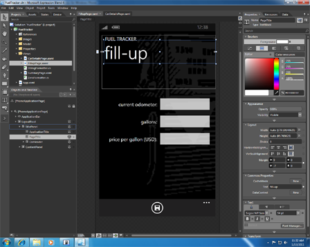
Visual Studio 2010 Express for Windows Phone включает в себя drag-and-drop дизайнер, который имитирует внешний вид телефона, редактор кода и отладчик. Если вы работали с Visual Studio для разработки других видов приложений, вы обнаружите среду для разработки мобильных приложений очень знакомой. На следующем изображении показан внешний вид Visual Studio 2010 Express for Windows Phone.
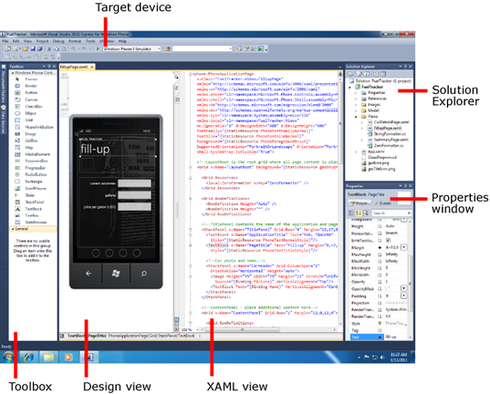
Дизайнер для Windows Phone содержит панель инструметов (Toolbox), режим дизайна (Design view), режим XAML (XAML view), обозреватель решений (Solution Explorer) и окно «Свойства» (Properties window), похожие на стандартный дизайнер Visual Studio. Два ключевых различий в том, что в режиме дизайна поверхность выглядит как Windows Phone устройство, и появилось целевое устройство (Target device), которое позволит вам выбрать, будет ли вы отлаживать приложение на устройстве или эмуляторе. На следующем изображении показан внешний вид эмулятора в портретной и альбомной ориентации.

Рекомендации по проектированию интерфейса (Design Guidelines)
Важно, что бы вы знали об установленных принципах проектирования интерфейса, если вы планируете опубликовать своё Windows Phone приложения в App Hub. Рекомендации по проектированию описывают, как спроектировать пользовательский интерфейс для своего приложения.
Рекомендации по проектированию интерфейса, сертификационные требования и другая важная информация будет повторяться в данной статье там, где она будет нужна.
В следующей таблице приводится краткое изложение основных принципов проектирования интерфейса и требований к приложений, которые необходимо учесть при проектировании и разработке вашего приложения. Полный и самый актуальный список рекомендаций по проектированию интерфейса вы можете найти по следующей ссылке.
UI Design and Interaction Guide for Windows Phone 7
| Категория | Рекомендации по проектированию |
|---|---|
| Навигация, фреймы и страницы |
|
| Панель приложения |
|
| Кнопка «Назад» |
|
| Ориентация экрана |
|
| Темы оформления |
|
| Настройки приложения |
|
| Сенсорный ввод |
|
| Экранная клавиатура |
|
| Элементы управления Canvas и Grid |
|
| Элементы управления Panorama и Pivot |
|
| Текст |
|
Дополнительные ресурсы
Ниже приведены некоторые ссылки на дополнительные ресурсы, где можно узнать больше о разработке для Windows Phone.
| Ресурс | Описание |
|---|---|
| Windows Phone App Hub | Дополнительная документация, примеры кода и сообщество по разработке для Windows Phone. |
| Windows Phone Development Documentation | Официальная документация по разработке для Windows Phone на MSDN. |
| Silverlight Documentation | Официальная документация по Silverlight и Silverlight for Windows Phone на MSDN. |
| Code Samples for Windows Phone | Скачиваемые примеры кода, которые дополняют документацию по Windows Phone. |
| Windows Phone QuickStarts | Сборник коротких статей, демонстрирующих задачи и возможности при разработке для Windows Phone. |
| Windows Phone Developer Guide | Руководство разработчика, описывающее историю фиктивной компанией, которая решила использовать Windows Phone 7 как клиентское устройство для уже существующих облачного приложения. |
| The Windows Phone Developer Blog | Блог, который содержит актуальную информацию и объявления прямо от команды по разработке Windows Phone. |
| Windows Phone 7 Development for Absolute Beginners | Серия видеороликов для абсолютных новичков, не требующая никаких навыков программирования. |
| Windows Phone 7 Jump Start | Серия видеороликов для разработчиков, не знакомых с разработкой для Windows Phone с использованием Silverlight или XNA. |
| Windows Phone 7 Training Course | Видеоролики и практические занятия по разработке для Windows Phone с использованием Silverlight или XNA. |
| .toolbox | Учебники и другие ресурсы для дизайнеров, обучающие, как разрабатывать дизайн приложения для Windows Phone. Включает в себя учебники по Expression Blend. |
| Jeff Wilcox Blog | Блог о Silverlight, Silverlight Toolkit и Silverlight for Windows Phone. Джеф Уилкокс — это ведущий разработчик программного обеспечения в Microsoft в команде Silverlight. |
| Jeff Prosise Blog | Блог о различных областях в программировании на .NET, в том числе Silverlight и Windows Phone. Джеф Просиз является опытным программистом и одним из основателей Wintellect. |
Следующая часть
We don’t know about you, but we’ve pretty excited about this Windows Phone 7 thing. The closer we get to that October(ish) release, the more desperate we get for all the juicy details on what to expect from Microsoft’s new mobile OS. Most of the information that we have on Windows Phone 7 up to this point has come from developer resources and documentation. The Microsoft UI Design and Interaction Guide for Windows Phone 7 is an attempt to communicate Microsoft’s design and UI principles to developers in the hopes of maintaining some level of consistency. The full guide is available from Microsoft (PDF link).
We’ve gone through the guide for you and broken out some of the guidelines/specs that we either haven’t heard or at least haven’t had confirmed. Get all of the details after the break and then let us know what you think in the comments.
- Start is always presented in portrait view.
- Start is a reserved space and only users can place tiles in this area. Windows Phones come with pre-placed tiles installed by Microsoft, phone manufacturers, and phone service providers.

Status Bar (pg 15)
- Signal strength, data connection, call forwarding, roaming, wireless network signal strength, bluetooth status, ringer mode, input status, battery power level, system clock.
- By default, only the system clock is always visible. If a user double taps in the Status Bar area, all other relevant indicators slide into view for approximately eight seconds before sliding out of view.
- Cannot be modified by developers, but can be hidden.

Application Bar (pg 16)
- Supports up to four icons.
Chrome positioning (pg 20)
- Status bar is always located on the edge of the screen closest to the Power button and furthest from the Start button no matter the orientation of the screen.
- Application bar is always located on the same edge of the device closest to the start button and furthest from the Power button no matter the orientation of the screen.

Notifications (pg 23)
- There are three methods to display push notifications:
- Tile notifications – Awareness notifications inform users of changes or events that may have occurred and are non-disruptive to the user workflow. They appear in Start tiles.
- Toast notifications – (Action-requested) notifications are system-wide notifications that do not disrupt the user workflow or require intervention to resolve. An example of these notifications is when the user receives a text message or instant message. These notifications appear at the top of the screen and are displayed for 10 seconds before disappearing.
- Raw notifications – (Action-required) in-application notifications are fully controlled by an application and affect only that application. These appear within an application.
Start Tiles (pg 24)
- Double-width tiles are only available to Microsoft, phone manufacturers, and mobile operators.
Toast Notifications (pg 25)
- Applications must default to turn toast notifications off.


Progress Indicator (pg 30)
- Can be determinate or indeterminate. Determinate is for tasks such as downloading content, indeterminate is for tasks like establishing a remote connection.
Page Scrolling (pg 31)
- Scrolling is accomplished strictly by swiping. Scroll bars are displayed, but only to communicate to the user where they are on the page.
Metro Colors (pg 32)
- 2 Background colors, black and white.
- 10 Default accent colors. Magenta, Purple, Teal, Lime, Brown, Pink, Orange, Blue, Red, and Green.
- Mobile operators or Device manufacturers can add one additional color.
- Blue is the default accent color, but this can be changed by mobile operators or manufacturers.
Multi-touch (pg 47)
- Windows Phone supports up to 10 touch points, but the hardware is only required to support 4.
Keyboards (pg 48)
- Only full alphabet keyboard layouts are supported. (No 12 or 20 key keyboards).
On-screen Keyboard (pg 49)
- 8 different context-specific keyboards. Default (QWERTY), Text, Email Address, Phone Number, Web Address, Maps, Search, SMS Address.
Hardware keyboards (pg 50)
- Required Keys
- Letters (A-Z), Enter, Space, Backspace, Shift, emoticon, SYM, period, and comma.
- Numbers (0-9) as either a primary or secondary character.
- Accent key for German, French, Italian, and Spanish keyboards.
- Unsupported Keys
- A directional pad or any other navigation specific hardware.
- The “OK & Home” and the “Send & End” hardware soft keys.
- The keys Delete, Insert, Control (CTRL), Alt, Caps Lock, Tab, page up and down, and escape (ESC).
- The Start, Search, and Back Buttons as part of the keyboard.
Power button (pg 57)
- Button press of 3-8 seconds turns phone off via software shutdown.
- Button press of more than 8 seconds turns phone off via hardware shutdown.
Camera button (pg 59)
- Half-press when taking picture will initiate auto-focus.
- Press and hold for more than one second when in standby or screen locked will activate camera application.
Get the best of Windows Central in in your inbox, every day!
Daniel Rubino is the Editor-in-chief of Windows Central, head reviewer, podcast co-host, and analyst. He has been covering Microsoft since 2007 when this site was called WMExperts (and later Windows Phone Central). His interests include Windows, laptops, next-gen computing, and for some reason, watches. Before all this tech stuff, he worked on a Ph.D. in linguistics, watched people sleep (for medical purposes!), and ran the projectors at movie theaters because it was fun.
- 11 min read
- Mobile,
Windows Phone
There is a prevalent belief amongst developers that design is a skill that can’t be learned — you either have it or you don’t. While much of this can be attributed to the perception that heightened creativity is required to produce good design, the truth is anyone can create attractive applications and good user experience by following common design patterns and applying guidelines for the particular platform being targeted.
So rejoice, Mr. “Not-a-Designer,” this article was written just for you. This article is targeted at the everyday developer looking for practical guidelines and tips to leverage in their Windows Phone application to build compelling Windows Phone UI-compliant apps with solid user experiences. Think of it as a checklist of sorts to ensure that your app avoids the common design problems found in Windows Phone applications.
Further Reading on SmashingMag:
- Testing For And With Windows Phone
- Introduction To Designing For Windows Phone 7 And Metro
- Finger-Friendly Design: Ideal Mobile Touchscreen Target Sizes
- Building An Online Magazine App For Windows 8
Please see the User Experience Design Guidelines for Windows Phone for a complete overview of the platform and user interaction model on Windows Phone.
More after jump! Continue reading below ↓
Panorama Controls
The aptly named Panorama is one of the innovative controls of the Windows Phone platform. Whereas a traditional mobile application is designed to fit within the boundaries of the screen, the Panorama control allows for a long horizontal canvas, to lay out elements that extend beyond the confines of the screen. The Panorama control is composed of a number of Panorama items, which contain the content. When viewing each Panorama item, the user will see a little piece of the item to the right, indicating that additional content is waiting to be discovered. As the user pans horizontally across the Panorama, the control exhibits a parallax behavior — smoothly moving the background, title and items at different speeds.
When creating your panorama, approach it as if you were designing a magazine cover — it should engage the user and entice them to explore more. It should reveal relevant, fresh and compelling content, and it should serve as the entry point to the rest of the application. Panoramas are great for showing a few pieces of content that you want to highlight in your app — the top news from your social network, the last eight songs played, the top six featured recipes. Consider also adding a background image to your Panorama control to provide a more visually appealing and immersive experience.
Given the popularity of the control, you can find inspiration for designing your Panorama in many apps on Windows Phone. Several of the native apps, or “hubs,” on Windows Phone also use the Panorama control, such as those for People, Pictures, Games and Office.

The native People “hub” Panorama without a background image on Windows Phone.

The native Pictures “hub” Panorama with a background image on Windows Phone.
Optimized for Up to Five Items
While fitting a lot of content into your main Panorama might be tempting, really think through what content will provide the best launch experience, and limit the number of items to five or fewer. Any more than five items will cause users to get lost in the Panorama control and will also result in a performance hit.
Don’t Compete With Swipe Gestures
The following controls would compete with swipe gestures in a Panorama:
- Toggle switches,
- Sliders,
- Maps,
- Web browsers.
The Panorama control provides horizontal scrolling to navigate the various items and vertical scrolling for each item. Using a control that accepts gestures for one of these actions in a Panorama would cause it to compete with the native functionality. For example, if a user wants to explore a Panorama control and swipes left in a Map control, then they will pan across the map, rather than move the panorama. For this reason, use only controls that don’t accept swipe gestures. There is one proviso — you could use a Map or Web Browser control in a Panorama as long as it is locked and doesn’t accept touch input.
Scrollable Items
The items on your Panorama control should scroll either horizontally or vertically, but not both.

Incorrect layout of Panorama, with items that scroll both horizontally and vertically.

Correctly designed Panorama, with items that distinctly scroll either horizontally or vertically.
Eliminate (or Limit) Interactive Content
The Panorama control is intended to be digested like a magazine cover — it’s a tool to reveal key content for the user and to serve as an entry point to explore the app. The Panorama should not be the application itself, so limit the use of interactive controls in it (forms, search boxes), and put them instead on pages within the app that are designed for those purposes.
Use the Application Bar for Actions
Avoid floating buttons (i.e. buttons placed within content) where possible. Ideally, all buttons should be placed in the Application Bar and should be changed or hidden contextually as the user swipes across the items.
Alignment And Layout
Left-Align Controls, With a 24-Pixel Margin
All pages should respect the 24-pixel margin on the left, which serves as a perimeter for content. Content should be left-aligned to the 24-pixel margin to continue the balance and flow of existing controls. Elements that creep outside or inside the margin create visual imbalance, drawing attention to the inconsistent margin.

Improper alignment of elements from top to bottom.

Correct left-alignment of elements
Tip: Check out Jeff Wilcox’s MetroGridHelper for a great little tool to help ensure that your controls are properly aligned, while also debugging your application.
The MetroGridHelper places a semi-transparent grid of 25 × 25-pixel red squares on your application when running in debug mode. These squares are contained within a padding of 24 pixels around the page and are offset by 12 pixels between one another — the magic combo for Windows Phone design. The grid enables you to quickly and easily identify any alignment issues on the page.

Adding MetroGridHelper to your app is very straightforward:
- Use the NuGet package manager to install the MetroGridHelper package, and add a reference in your project.
- Open the
App.xaml.csfile, and addMetroGridHelper.IsVisible = true;to the constructor within the block of code that checks whether the debugger is attached. Your complete constructor should look like this:
 /// Constructor for the Application object. ///
        public App()
        {
            // Global handler for uncaught exceptions.

            UnhandledException += Application_UnhandledException;
            // Standard Silverlight initialization
            InitializeComponent();
            // Phone-specific initialization
            InitializePhoneApplication();
            // Show graphics profiling information while debugging.

            if (System.Diagnostics.Debugger.IsAttached)
            {
                // Display the current frame rate counters.

                Application.Current.Host.Settings.EnableFrameRateCounter = true;
                // Show the MetroGridHelper
                MetroGridHelper.IsVisible = true;
                PhoneApplicationService.Current.UserIdleDetectionMode = IdleDetectionMode.Disabled;
            }
        }
Lay Out Field/Value Pairs Cleanly
When creating a page with a set of field and value pairs, the textblock elements should be presented either in two columns, both aligned left, or with the titles above the fields.

Incorrect layout makes it difficult to discern where the label ends and the value begins.

A two-column layout produces an interface that is cleaner and easier to read.

Placing the label above the field is the best approach because it creates visual hierarchy and clearly distinguishes between field/value pairs.
Space Elements by a Multiple or Subdivision of 12 Pixels
Spacing between elements should be consistent both horizontally and vertically. A multiple or subdivision of 12 pixels is recommended in order to adhere to the design grid.

Inconsistent horizontal and vertical spacing.

Consistent spacing creates a cleaner layout.
Animation And Visual Feedback
Tip: The Silverlight for Windows Phone Toolkit lets you easily add tilt animations, page transitions and a performance progress bar to your application.
Visual Feedback via Tilt Animations
Buttons, list items and other controls being used as buttons should have a tilt effect to provide visual feedback to the user. Changes in color should not be used for visual feedback.
Visual feedback has the following benefits:
- It helps to distinguish between interactive and static elements,
- It allows the application to communicate back to the user and confirm the user’s actions.

Using color changes to provide visual feedback would be inconsistent with native apps.

Tilt animation provides visual feedback and makes the user experience consistent.
Implementing the tilt effect requires only a couple of lines of code in your XAML page:
- Add a reference to
Microsoft.Phone.Controls.Toolkit.dllin your project. This DLL is installed with the Silverlight for Windows Phone Toolkit. - Add a
namespaceto the XAML that references the DLL:xmlns:toolkit="clr-namespace:Microsoft.Phone.Controls;assembly=Microsoft.Phone.Controls.Toolkit". - Set the
IsTiltEnabledproperty ofTiltEffecttotruein thePhoneApplicationPagetag:toolkit:TiltEffect.IsTiltEnabled="True".
That’s it. The final XAML of your PhoneApplicationPage tag should look something like this:

Use Page Transitions to Add Polish
Page transition animations can add attractive effects to an application and communicate to the user that they are navigating between pages.

Turnstile page transition.


Turnstile page transition.
Six page transitions are included in the Silverlight for Windows Phone Toolkit:
- Turnstile,
- Swivel,
- Slide,
- Roll,
- Rotate.
Adding page transition animations is similar to adding the tilt effect:
- Add a reference to
Microsoft.Phone.Controls.Toolkit.dllin your project. This DLL is installed as part of the Silverlight for Windows Phone Toolkit installation. - Add a namespace to the XAML that references the DLL:
xmlns:toolkit="clr-namespace:Microsoft.Phone.Controls;assembly=Microsoft.Phone.Controls.Toolkit". - Paste the XAML code below into your page:
Use a Bar to Indicate Progress
Just as you use tilt animation to indicate to the user that their tap has taken effect, progress bars enable you to communicate that a process is being executed. This removes doubt for the user about whether the application is functioning properly. Two types of progress bars can be used: determinate and indeterminate.

Determinate progress bar.

Indeterminate progress bar.
A determinate progress bar is used to communicate the percentage of completion, such as the percentage of bytes copied out of the total number of bytes. An indeterminate progress bar is much more common and is particularly useful when you don’t know the length of the process, such as when calling a Web service and waiting for a response.
Buttons
Place Buttons in the Application Bar

Collapsed application bar.

Expanded application bar.
Avoid floating buttons (i.e. buttons placed within content) where possible. Such buttons usually make the experience inconsistent and confusing. The Application Bar serves as a fixed home for buttons on the page, a design paradigm that is consistent with native apps. Another big benefit is that the Application Bar is always visible, even when the software keyboard is shown. This eliminates the common problem of buttons being hidden behind the keyboard, and it allows for instant access to the buttons. Floating buttons might make sense in a few places, though:
- “Settings” pages, where more verbose actions are needed,
- Quick action buttons associated with list entries, such as a “Play” button next to a song item or a “Call” button next to a contact item in a list.
Avoid “Back” and “Close” Buttons
Every Windows Phone has a physical “Back” button. Windows Phone users are used to using the hard “Back” button to navigate back in an application or to end (or cancel) an action, thus eliminating the need for a soft “Back” button. The result is a more consistent experience and less clutter.
Avoid “Home” Buttons
“Home” buttons break the Windows Phone’s navigation model and are strongly discouraged. Users know to use the hard “Back” button to navigate back to the home screen. A “Home” button might make sense in a few scenarios, though:
- Applications with a very deep navigation hierarchy,
- Pages that launch via a deep-linking “secondary tile.”
If you do end up using a “Home” button in your application, make sure that you completely clear out the back stack upon navigating to the home page. This is critical because without clearing the back stack, the user could get stuck in a near infinite loop and would be unable to exit the application via the hard “Back” button. To clear your back stack, override the OnNavigatedTo method on the page that you are navigating to, and add in the code shown here:
protected override void OnNavigatedTo(System.Windows.Navigation.NavigationEventArgs e)
{
    while (NavigationService.CanGoBack)
    {
        NavigationService.RemoveBackEntry();
    }
    base.OnNavigatedTo(e);
}
The above code is a simple loop which checks to see if the application can go back and removes the most recent item off the back stack. Once it can no longer go back, your back stack has been cleared.
Summary
One of the most important factors in delivering the best experience on any mobile platform is to design the app for the platform and its accompanying usage patterns.
The Windows Phone UI represents a fresh approach to the phone experience. The first step in building a compelling Windows Phone UI-compliant application is to spend time using the apps that ship with the OS. This will familiarize you with Windows Phone’s unique set of controls and design paradigms.
A lot of beautifully designed third-party apps can be found in the Windows Phone Marketplace, so plenty of inspiration is available. Some of my favorites have innovated on the Windows Phone design principles to deliver a truly compelling experience, such as the Cocktail Flow app published by Gergely Orosz.
Once you have the basics down and have begun to piece together the visuals for your application, refer to the guidelines in this article. They will help you avoid some of the most common mistakes that I have seen when reviewing designs for my app partners.
(al)
1- Elements Alignment and Margins
— All pages should respect the 12px or 24px margin on the left.
— Content, titles, headers, and header logos should be left aligned to 12px or 24px margin.
— If right alignment is required, the right edge margin will be also 12px or 24px.


— Tip: Check the semi-transparent grid of 25 × 25-pixel red squares on your application when running in debug mode. These squares are contained within a padding of 24 pixels around the page and are offset by 12 pixels between one another — the magic combo for Windows Phone design. The grid enables you to quickly and easily identify any alignment issues on the page.

— Field and value pairs should either be presented in two left aligned columns, or with the tile above the content as in the contact detail page in the people hub.


2- Element Spacing
Spacing between elements should be consistent both horizontally and vertically. It is recommended that elements are spaced a multiple or subdivision of 12px apart in order to follow the design grid.


3- Control Feedback on Tap
— When using standard controls such as Buttons, List Items .. etc, should use the standard Windows Phone tilt effect.
— No background, foreground, or border color changes
— Other controls, no animation or color changes are permitted
— Color change of any description is not permitted for touch feedback
4- Lists
— Tilt animations must be used to indicate a list item has been pressed.


— List items should not have a selected state, unless in a picker.
— Use strong consistent typefaces across the app, make list item text at least 12 pixels in height and make it ease for touch, and make sure that the text is legible from all angles and sizes.
Backgrounds
— Backgrounds are discouraged. They are allowed for brand reasons and to support contrast. Instead, use any accent colors on the text foreground
Layouts
— Use text size and color to establish list item hierarchy. See the Photoshop templates for a fullrangeof list templates.
Enhancements
— List enhancements should not be used unless they are distinct from one another, such as in a menu. A rule of thumb is that Icons in a circle represent actions and those without are for indication.
Scrollable Content
-If you have scrollable content on your page, you should put 95px bottom padding at the end of your content. This way the content doesn’t reach all the way to the very bottom of the page.
For example, here is a simple page that is slightly higher than the visible area:
— if the user scrolls to the end of the page, the rubber band effect will come into view and the content will be pulled slightly above the bottom. But once the scroll is released, the content bounces back down to the edge of the screen once again.
— While it doesn’t poke your eyes and it generally works OK, having content stretched all the way to the bottom is not ideal. The quick fix for this is adding 95px margin to the bottom to move your content away from the bottom – regardless if it is bottom of the phone chrome or the application bar. The final result is more pleasing to the eye.
— You can see the same padding in effect if you check the profile and history pages on any of your contact. It is also present on the new appointment page in the Calendar app and in the Internet Explorer’s settings page. Speaking of settings, scroll down to the bottom in the Settings application.


5- Pivot Controls
Pivot Pages
— All pivot controls should have at least two pages in them
Controls not permitted in Pivot
— Toggle switches
— Sliders
— Maps controls – unless they are static (pinch/zoom/pan are disable etc.)
— Browser controls — unless they are static (pinch/zoom/pan are disable etc.)Gesture Competition
— Controls that provide a horizontally scrollable area or take a horizontal swipe gesture are not permitted in the pivot control as the horizontal swipe gesture is reserved for changing pivot pages.

Empty Pivot Pages
— If a pivot page relies upon user interaction in order to populate it with content, then placeholder text/image should be included that indicates to the user that content is outstanding. For example, if there are no items displayed on an ‘Unread email’ pivot page, then the page should not be removed, it should simply state that no content is available at this time.
for more information check: Pivot control design guidelines for Windows Phone

6- Panorama Controls
Controls not permitted in Panorama
— Toggle switches
— Sliders
— Maps controls – unless they are static (pinch/zoom/pan are disable etc.)
— Browser controls — unless they are static (pinch/zoom/pan are disable etc.)
Application Bar
— Common actions such as refresh, search and settings should be placed in an application bar.
— The options available in the application bar can change contextually with the panorama pane.
— Floating buttons on the panorama should be avoided or be kept to minimum
Gesture Competition
— Controls that provide a horizontally scrollable area or take a horizontal swipe gesture are not permitted in the panorama control as the horizontal swipe gesture is reserved for changing panorama pages.
Scrollable Panes
— Panorama panes should either scroll vertically or horizontally. Not both.

— All panorama panes should not scroll vertically. If this is the case a pivot control is probably more suitable.
— Using a variety of panorama panes (vertical and horizontal) will improve the overall user experience and make the panorama easier to navigate.Navigation
— Floating buttons should be avoided. If necessary provide a navigation section to allow users to dig deeper into the content.
— The native Pictures and Music & Videos panorama have good examples of this. Generic tasks should be placed in the panorama app bar.

Interactive Content
— Minimize the use interactive content on the panorama (forms, search boxes etc.).
— Panorama controls should be used to entice the user to explore (i.e. overview about the app).
— Use only a small set of tasks at this level that are fresh, dynamic and compelling.
— The panorama control should not be your entire application.
Number of Panes
— A maximum of five panes are recommended. Any more than five and they will be difficult to navigate and performance will take a hit.
Background
— Panorama controls should have a background. These can be textures brand elements, graphics, photos.
— Ideally they should be engaging and where possible contextual.
Title
— The panorama title should be animated.
— The rate of motion for the panorama title is that it should be slow relative to the topmost content layer, and slower than the background art (if applicable).
Section Titles
— The font size should be larger than the corresponding content.Photoshop templates are available tofacilitate panorama design.
for more information check: Panorama design guidelines for Windows Phone
7- Headings
— Headings should be left aligned, and should not have backgrounds, borders, underline, or any other kind of decoration.
— The exception to this is panorama pane titles, which may use corporate branding.
— Also see text guidance section of this blog.
8- Buttons
Placement
— Wherever possible, buttons should be placed in the application bar.
Exceptions to this include:

— Panoramas — where guidance Error! Reference source not found may apply.
— Dialogs and settings where more verbose actions may be needed.
— Quick actions (for example call history on a Windows Phone)

Close Buttons
— Windows Phone applications do not need close buttons, as closing actions are handled by the hardware back button.
Back Buttons
— Back buttons are not permitted anywhere in Windows Phone. The user will make use of the hardware back button on the device.
Home Buttons
— Home buttons should be avoided as they can prove problematic to the Windows Phone navigation model. This becomes most evident if a user actions both the home button and the hardware ‘back’ button to navigate which may result in a loop effect.
9- Pickers
— The standard pickers should be used for picking the date and/or time, or for choosing a letter of the alphabet.
— Should a nonstandard picker be required, these should follow the look and feel of the ringtone picker in the Settings app on the device.
10- Start Tiles
Primary Tiles
— Start tiles should not have rounded corners or three dimensional elements to them. They should fit in with the look and feel of other items in the Start menu.

— Ensure standard tile templates are used
— The app logo should appear in the space dedicated to it in the template
— Logos should not be duplicated on the tile
— If the name of the app is included as part of the tile image, then the app name should be removed from the manifest to avoid it appearing twice
— Avoid including localized text in image files for tiles
— Start tiles should avoid having a full black (#000000) or full white (#FFFFFF) background, as these will not render properly in the dark or light themes.
Avoid using relative time stamps or dates (eg. ‘two hours ago’). This is a static statement and will become inaccurate as time progresses. Instead, use an absolute date or time (eg. ’14:00’)
Secondary Tiles
— Secondary tiles should not link to static content
— Secondary tiles should not interact with the app (eg. ‘skip to next track’)
— Good examples include pinning a news category that updates regularly or a specific stock with an updating share price
— Avoid pinning to content that may not be available to users when they access the app at a later date (eg. a specific news article that is no longer current and has been replaced)
Wide Tiles
— The wide tile should only be used to display new, interesting content and notifications which are updated frequently (at least weekly).
— Wide tiles must be live.
for more information check: Tile design guidelines for Windows Phone

11- Browser Controls
— Browser controls should not be embedded in any pages in an app. The user should always be taken off to Internet Explorer on the device.
— Links that navigate a user away from the app should clearly state that this will happen.
Exceptions
— Where the user is being taken to a single page for authentication (such as with Facebook or Twitter), and no Xauth or similar API is available for the authentication controls to be implemented in Silverlight controls, the authentication can be performed in an embedded web browser control in the application.
12- Dialog Boxes
— Use the standard Windows Phone Dialog box. Single buttons should be left aligned and multiple buttons centre aligned.
— Avoid creating custom dialog boxes – If this is unavoidable ensure the behavior of the custom control mimics that of the native dialog box.

— The Windows Phone toolkit also has a dialog control that allows for a greater degree of customization.
for more information check: http://msdn.microsoft.com/en-US/enus/library/microsoft.xna.framework.gamerservices.guide.beginshowmessagebox.aspx
13- Contrast
— There must be sufficient contrast between the background and foreground of controls on the page.
— This is particularly important for panoramas, where the background image can often interfere with the legibility of text. If this happens, either replace the image, or apply a semi-transparent black (or grey) layer over the image.
14- Text
Text Case
— Titles in Windows Phone should always be lowercase with the exception of section titles which should be all uppercase. If brand guidelines insist on a different case, then ensure that the use of the case is consistent across the app.
Custom/Brand Typefaces
— Custom or brand typefaces can be used in moderation in the application, though care should be taken. Custom typefaces can be used for page titles or panorama section titles. Segoe WP should be used everywhere else.
— Be careful if the typeface closely resembles Segoe WP, such as Arial or Helvetica, as mixing these with Segoe can look odd.
15- Images
— Images used within the application on backgrounds or UI elements should properly fit the application.
— Aspect ratios should be respected, images should not be pixilated or smudged as a result of scaling, and images with transparency should have proper anti-aliasing to ensure they display properly on different colored backgrounds.
— For most apps, we recommend that you include only WXGA assets. WXGA assets have the highest quality, and they automatically scale to work well for other resolutions. Multi-resolution apps for Windows Phone 8

16- Icons
Metaphors
— Don’t mix metaphors. Users recognize certain icons to mean certain things, either because they are used elsewhere in the device or because they are commonly associated with something else. For example:
— If no icon exists for the metaphor you are trying to convey, create one. Do not repurpose existing icons.

Look and Feel
— Icons should respect the Windows Phone design style look and feel – simple, one color, and two dimensional.
17- Touch Targets
— Ensure your application is optimized for touch.
— Minimum font size is 15pt
— Recommended touch target size is 9mm
— Minimum touch target size is 7mm
— Minimum spacing between elements is 2mm
— Visual size is 60-100% of the touch target size
— Provide feedback when an item is touched


18- Typos
— The app should not have any spelling mistakes.
— Copy that is spelt incorrectly looks bad and could negatively impact the brand perception.
19- Theme
— The application should either respect the theme and accent color changes of the device, or should have a fixed theme that is not affected by such changes.
— All elements should be visible and have appropriate levels of contrast regardless of theme.
20- Splash Screen
— Provide different splash screens for the different resolutions

21- The Hardware Back Button
— The hardware back button should always allow a user to complete one of the following tasks:
1. Dismiss temporary UI elements such as dialogs, keyboards (SIP) or pick lists.
2. Move backwards through the back stack.
— The back button must not be altered under any circumstances. This includes its behavior when implementing secondary tiles (please refer to section 4.1.22)
22- Secondary Tiles (deep linking)
— Secondary tiles are designed to launch the user into specific areas of the application. They are designed to allow quick and easy access to content and are generally not used as an entry point for exploration.
— Good examples of secondary tiles can be found on the device itself. For example, a pinned album from music and video will play the album when tapped. The tile serves as a specific purpose – go to the album and play it.
— Users can also pin people to the Start screen. Tapping on one of these tiles takes the user into the contact card pivot where they can see all the information and tasks related to that specific contact.
— Pressing the hardware back button returns the user to the Start screen.
Pinning
— The Pin icon should be used in the application bar to indicate that an item/section of the app can be pinned to the start screen. Please do not repurpose existing icons.
— Pinning can also be activated by using the touch and hold context menu – this is available in the Windows Phone toolkit.
— The pinning action should always be initiated by the user, or permission from the user should be sought. Do not pin items to a user’s Start screen without requesting their permission first.
Hardware Back Button
When a user launches an application by tapping on a secondary tile, pressing the hardware back button should exit the application (i.e. return to the Start screen). The behavior of the hardware back button should not be altered in any way.
23- Lock Screen
— Background images should contain minimal text to avoid conflict with on-screen messages
— Background images should be simple – ‘busy’ images affects the legibility of on-screen messages and notifications
— Logos should be kept small to avoid competition with date, time and notifications
— If text is included, it should related directly with the image
— The visual focus of the lock screen should be the image, not the logo or text


24- Lens Design
— Apps should support a left-pointing arrow icon to indicate that additional photos are available
— The animation for ‘Save’ and ‘Capture’ should be consistent
— Tap-to-tap capture and the camera hardware button should be supported
— Half-press to focus should be supported
— Focus brackets should function as they do for the basic camera where relevant
— Capture and confirm apps should use a consistent set of icons (‘save’ and ‘delete’) along with animation for confirming and cancelling the storage of the item.
— ‘Cancel’ and ‘save’ should return the user to the viewfinder. These icons are included with the Windows Phone SDK.
Rich Media Open Link
— The open link should launch an experience tailored to viewing or editing a selected item and not action a generic app launch point
— Displaying branding elements on items stored in the camera roll should be avoided – users should be able to share and edit these items without visual distractions
for more information check: Lens design guidelines for Windows Phone
25- Page Transitions
— Animations should be implemented when moving between pages. This effect is available from the Silverlight for Windows Phone Toolkit.

— couple of page transitions are included in the Silverlight for Windows Phone Toolkit:
- Turnstile — To transition between contextually different areas
- Swivel — Partial and transient UI
- Slide — Staying in context while showing a set of options, and No forward navigation
- Tilt – Natural feedback a control is pressed
— Use a bar to indicate progress
- Just as you use tilt animation to indicate to the user that their tap has taken effect, progress bars enable you to communicate that a process is being executed. This removes doubt for the user about whether the application is functioning properly. Two types of progress bars can be used: determinate and indeterminate.
Determinate progress bar.
Indeterminate progress bar.
- A determinate progress bar is used to communicate the percentage of completion, such as the percentage of bytes copied out of the total number of bytes. An indeterminate progress bar is much more common and is particularly useful when you don’t know the length of the process, such as when calling a Web service and waiting for a response.


26- Language and Tone
— Do not use computer jargon, hexadecimal error codes, or text that assumes computer knowledge.
— Use an authentic and clear tone and reflect the language that is used by the audience.
— Use friendly, light hearted and empathic tones. Never use angry or mechanical tones in the application.
In Conclusion
These are just recommendations from different cases studies that are usually application specific. So, feel free to do what is right for your application taking into consideration some success factions like:
— Deliver the best experience on any mobile platform is to design the app for the platform and its accompanying usage patterns.
— The first step in building a compelling Windows Phone UI-compliant application is to spend time using the apps that ship with the OS. This will familiarize you with Windows Phone’s unique set of controls and design paradigms.
References:
1)http://blogs.msdn.com/b/africaapps/archive/2014/03/08/ux-guidelines-for-windows-phone-8.aspx
2)http://msdn.microsoft.com/library/windowsphone/develop/fa00461b-abe1-41d1-be87-0b0fe3d3389d(v=vs.105).aspx
Have a nice day by
Application Bar Icons for Windows Phone 7
These icons are now installed locally as a part of the Windows Phone Developer Tools. You can find these icons on your computer after you have installed Windows Phone Developer Tools at the following locations:
- 32-bit computers — C:Program FilesMicrosoft SDKsWindows Phonev7.0Icons
- 64-bit computers — C:Program Files (x86)Microsoft SDKsWindows Phonev7.0Icons
UI Design and Interaction Guide for Windows Phone 7
Windows Phone introduces a touch user interface (UI) based on a design system codenamed Metro. This guide provides detailed information about UI elements and controls, UI system behaviors, and the interaction model for the touch interface. Designers and developers should read this guide to learn the dos and don’ts of UI implementations for their Windows Phone applications.
Microsoft Expression Blend for Windows Phone
Expression Blend for Windows Phone is installed as a stand-alone application with the Windows Phone Developer Tools and enables you to create Windows Phone applications using built-in templates. These templates enable you to preview application styles, set the theme, customize the application bar, define page navigation, optimize text input scopes, and select keyboards.
Design Templates for Windows Phone 7
A collection of 28 layered Photoshop template files that can be used to create pixel-perfect application layouts, to help guide UI development, or to pitch an idea. These design templates showcase many controls that are a part of the Windows Phone Developer Tools. They also include examples of controls that are a part of Windows Phone, but are not available as a part of the Windows Phone Developer Tools. These additional templates are included to help designers and developers maintain a consistent look and feel across applications for system controls that developers wish to mimic.
Windows Phone Design System — Codename Metro
A visual explanation of the inspiration behind the Windows Phone design system codenamed Metro, the seven areas of Windows Phone differentiation, and the Red Threads that are the principles Microsoft used to guide the experiences built into Windows Phone
At the MVP Global Summit in 2010, Microsoft stunned the attending MVPs by announcing Windows Phone 7 (WP7). For two years, I sat in the Summit sessions listening to the giants of the Windows Mobile programming world tell Microsoft they needed to up the ante in the mobile wars. We had been hearing rumblings of Windows Mobile 7 for a while, but no details. Most of us thought it would be more of the same old thing. When Microsoft told the session attendees that there had been a change in focus and a change in direction, it was welcome news. As they informed us of their new vision, I was completely overwhelmed. This article is an attempt to convey what I heard. I anticipate you will be as excited as I am.
The Beginnings
In addition to revamping the management and programming teams and rewriting the operating system from the ground up, Microsoft spent a great deal of money and time in research to determine the target audience of the new platform. Their research led them to the concept of “Life Maximizers.” These are people who are juggling families and businesses or jobs. They are extremely busy and are looking for ways to manage their time and life in a more focused manner. Microsoft developed a phone system that reflects the speed of people’s lives in motion and provides a seamless experience in use.
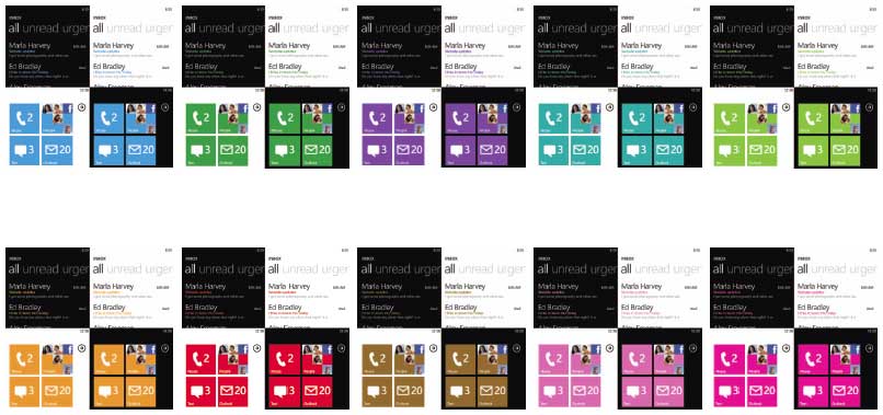
Using this concept, Microsoft developed a user interface (Figure 1) that works in tandem to the busy lifestyle of their target audience to bring an integrated experience. To keep the UI free from clutter and non-essential information, Microsoft developed the “Metro” theme. This theme comes from the busy urban environment where white lettering on dark color backgrounds conveys information immediately to the seeker.
In keeping with this theme, Metro uses a black background with white lettering. Metro concentrates on a clean, light, and fast interface using various fonts to enhance the visual experience. Animation in Metro is well thought and is an adjunct to the Metro experience rather than gratuitous programming candy. The entire focus of Metro is on content and making it readily available to the user. This combination is easy to read, easy on the eyes and aesthetically pleasing.
Hardware
One of the lessons learned in the mobile wars is that standardization of hardware is essential to the success of any given mobile platform. Microsoft embraced this lesson, telling the hardware manufacturers that there is a minimum set of standards that must be met if they wish to use WP7 as their core operating system. These include as a minimum:
- Screen resolution
- 480 x 800 (initial release)
- 340 x 620 (available in the future)
- 4-point capacitive multi-touch
- 1 GHz processor
- 8GB flash memory (no SD card support)
- 5MP camera
- Sensors (accelerometer, GPS, compass, proximity, and light)
- 3 hardware buttons (Back, Search, Home) + Camera button
- FM radio receiver
By limiting the hardware to a specific set of standards, programmers can develop software to that specification, knowing that their software will run on all phones running WP7. This is a bold departure from the Windows Mobile 6.5 model where there were numerous form factors and hardware.
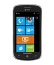
The following hardware manufacturers have announced their hardware for WP7: HTC Corp, Dell, LG, and Samsung. These manufacturers ensure that you will have a choice of options and features when you go to buy your new WP7.
Hubs
In addition to the Metro theme and standardization of hardware requirements, Microsoft planners developed the concept of “hubs” — dynamically updated real-time centers — which serve to aggregate information into a central place where access is quick and timely. No longer is the user dependent on static icons to launch their experience. There are a number of hubs in the new design.
Real-time hubs aggregate all of the user’s information into a central space for quick access.
People Hub
This hub aggregates feeds from all of the user’s live feeds from social networks and photos into a single location. It will show you up-to-date information and allow you to post updates to Facebook and Windows Live.
Pictures Hub
This photo wallet application allows you to share pictures and videos with your favorite social networking site. You integrate both the web and the PC creating one spot for your entire picture and video collection.
Music + Video Hub
This hub gives you the full media experience of Zune, including all of your PC content, online music services and FM radio stations. Utilize Zune Social to share media with your friends.
Marketplace
You can discover new pre-certified apps and games and download them to your phone.
Office
With the power of Office Mobile, which is included in the release, you can stay productive on the go. You have access to Office, OneNote, and SharePoint workspace in one spot. You can easily read, edit and share documents. Your calendars and email are now easier to manage with color coding to separate work from personal. At release, WP7 users will have access to cloud services which will sync documents to and from your PC.
Xbox LIVE Hub
The Xbox Live hub is your entry point from WP7 to your Xbox Live account. You can track and keep up to date on your points, avatars, unlocked achievements, etc. Because the mission of WP7 is to aggregate web information and make your life easier to manage, WP7 will update the Xbox Live tile to show your friend requests or other gaming actions available.
By including both the Zune hub and the Xbox LIVE hub in WP7, Microsoft made a calculated move to entice its existing user base of millions of Zune and Xbox users to move to WP7 for a continuation of their current experience. Electronic Arts is partnering with Microsoft for WP7 and has an entire line of games available for WP7.
WP7 also supports the concept of “live tiles.” A tile is a link to an application and provides real-time updates to content. For example, an email live tile may show the number of unread messages, the phone live tile will show missed calls or voice mails. This is an attempt to coordinate all of your information in one convenient spot. Figure 1 shows the Xbox LIVE and people hubs as well as a few blue live tiles.
Live tiles show real-time application information at a glance.
The Developer Story
When Microsoft announced their vision for the WP7 future, they included both Silverlight and XNA C# as the development platforms. Which one you choose for your development platform depends on numerous reasons. See the sidebar to help you determine which one to use. One of the major stumbling blocks in Window Mobile 6.5 was the lack of inexpensive tools to promote development. With WP7, Microsoft announced Visual Studio 2010 Express, a free edition of Visual Studio complete with all the necessary bits to create phone applications. It includes:
- Expression Blend for WP7
- WP7 developer tools
- Silverlight 4 toolkit
- XNA 4.0
- Visual Studio Express
This decision opens up the programming market for WP7 to anyone with a computer and an Internet connection.
Taking it a step further, Microsoft announced that current students enrolled in school can request a subscription to Dream Spark and receive professional versions of the development tools.
The Windows Phone Marketplace
The Windows Phone Marketplace (WPM) is Microsoft’s response to the Apple App Store. A number of the policies are equivalent to the Apple store:
- $99.00 fee to join the developer network (developer.windowsphone.com)
- 5 free apps (additional at $19.99)
- Unlimited paid apps
- The fee is waived for students via the Dreamspark program.
- 70/30 revenue split on paid apps
- Payable when $200.00 in revenue is accumulated.
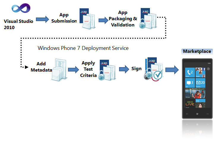
Developing for WP7 is a comprehensive process and is outlined in Figure 2, which shows the application development lifecycle from start to finish.

Any apps submitted to the WPM will be verified for content which must conform to the rules in the WP7 Application Certification Requirements document available at windowsteamblog.com/windows_phone/b/wpdev/. Figure 3 shows the application certification process.
The WPM also offers a number of options that are not available to Apple developers. These include a trial API and various business models to suit individual business requirements.
The trial API allows the developer to control the type and length of the trial with a few lines of code. Since the full version of the program is already included in the download from the marketplace, using the trial API allows your user to upgrade to the premium version with no further downloads. Once the transaction for the paid app is processed, the app is unlocked and fully operational.
Using the trial API is as simple as adding a reference to Microsoft.Phone.Marketplace to your application and then calling LicenseInformation.IsTrial(). It returns true if the app was installed in trial mode and allows you to modify the behavior as desired.
Business models include the free and paid apps mentioned above and ad-funded and “freemium” models.
The ad-funded model has a number of features unique to WP7. These are live tiles, pinning and toast. Ad-funded applications are downloaded to the phone from the Windows Phone Marketplace and the developer can create a live tile for the app which permits them to keep in touch with their customers, sending information, news of updates, promotional information and coupons, etc., which are displayed on the live tile for the user to see and interact with.
The user can also pin the application live tile to the Start screen giving it preference in the list of tiles so that they can see and keep informed. If neither of these two modes is in use, the third option to keep in touch with your users is to toast them. A toast is an instant message which pops up at the top of the phone and alerts the user to something new, in this case, a message from you.
A “freemium” application is one that is free on the marketplace but requires a paid service to utilize. Netflix is a great example. The app is free, but unless you have a subscription to the Netflix service, the app is useless.
One of the perceived drawbacks to the initial release of WP7 is the fact that the enterprise functionality of WM 6.5 is not available. Version 1 is targeting the individual “life maximizers” not the enterprise. The enterprise functionality will return to Windows phone in the future.
Installing Apps to Your Phone
The only way you can load an app to a phone outside the development environment is through the marketplace; however, at this time, there is no provision in the marketplace to limit availability of your application to a select list of potential users or to create a market within the marketplace. Post your app on the marketplace and the whole world has access to it.
You can use either XNA or Silverlight as the platform for application development. Currently, the only supported development languages are C# and Visual Basic. WP7 does not support Silverlight running in a browser; therefore, all Silverlight applications for WP7 run out of the browser.
I’ll develop the examples for this article in Silverlight and C#. This new version of WP7 also brings a new paradigm for development. No longer do developers, carriers or handset manufacturers have pInvoke access to the underlying operating system. All access is through a managed API.
MVVM (Model-View-ViewModel)
One of the default best practices for developing an app for the new phone is to use the MVVM design pattern. MVVM is not difficult to understand or implement and there is much information available via Bing to show how to use this pattern in your development. Essentially, it splits the app into at least three tiers:
- The View is the page you design.
- The Model is your data feed
- The ViewModel is a POCO (plain old CLR objects) class inheriting from INotifyPropertyChanged. This class contains property definitions for each of your fields on the view and methods implementing necessary business logic.
The fields on the View are then bound directly in the XAML and are updated when the ViewModel informs the View that the property has changed. Multiple views can be bound to the same ViewModel.
Purists argue for no code in the code-behind file and that all communication between the View and the ViewModel be based on the principle of commanding and/or relay messaging. While this is the ultimate, many programmers use the code-behind routinely.
Besides the obvious benefit of separation of concerns and cleaner coding, this pattern provides easy unit testing of your code.
Unlocking Your Phone
To get started, either download Visual Studio 2010 Express or, if you already have a paid version of Visual Studio 2010 installed, download and install just the Windows Phone Developer Tools (download from http://developer.windowsphone.com).
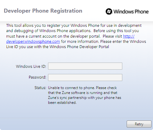
When you download and install the phone bits, there are two programs placed in the Windows Phone Developer Tools folder in your Start directory: the Windows Phone Developer Registration program and the application deployment tool.
Figure 4 shows the Windows phone developer registration UI. You must enter the Windows Live ID and password that you used to register with the developer network. Once you have done so, the phone is unlocked so that you can push your apps from Visual Studio 2010 to the phone. Registering as a developer allows you to unlock three phones for deployment. At any time, you can delete a phone and add a different one. Outside of the Marketplace, this is the only way to deploy apps to the phone.
The deployment app that comes with the installation allows you to install a xap file, after registering your phone, directly to your phone without going through Visual Studio 2010.
Beginning Your First Phone App
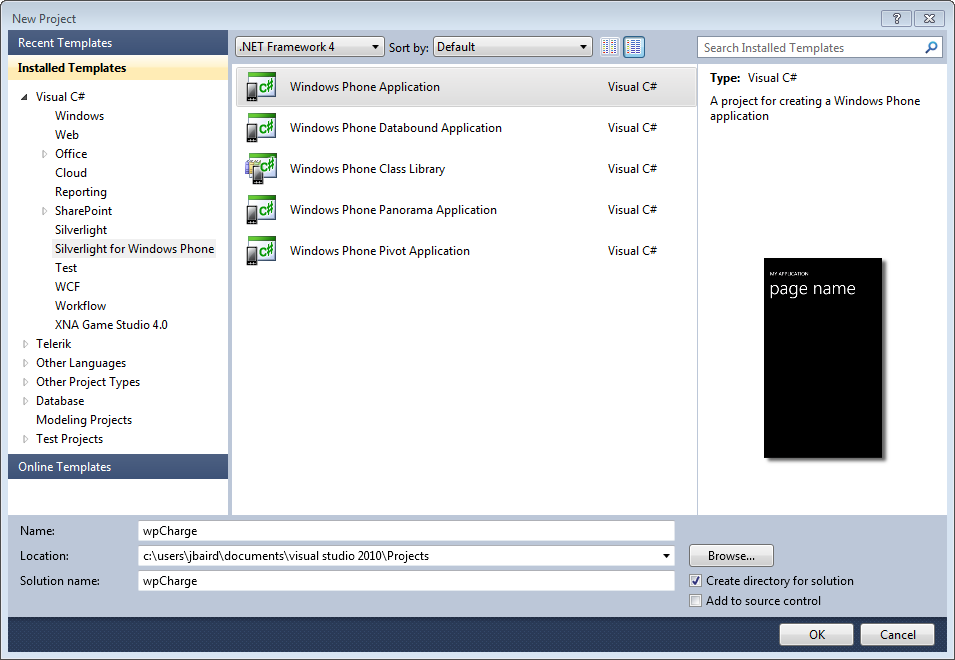
Launch Visual Studio and select New Project. Choose the Silverlight for Windows Phone templates. You want to choose the template that will be most useful for your application. In this case, choose the Windows Phone Application and provide a name your project (Figure 5).
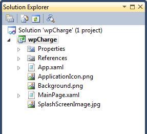
This template generates a project containing a number of files (Figure 6):
- App.xaml — This file and its corresponding code behind permits you to control application-wide settings and behaviors.
- MainPage.xaml — This is the main page that displays when the app is loaded and running.
- Application Images — Resources for the application and the default splash screen.
Double-click on the MainPage.xaml (Figure 7). In the XAML code, there is a StackPanel in the main LayoutRoot grid that sets application information about your project and applies a set Metro style to the data entered. Any XAML that you add to the page will go in the grid named ContentPanel in the middle of the XAML code list.
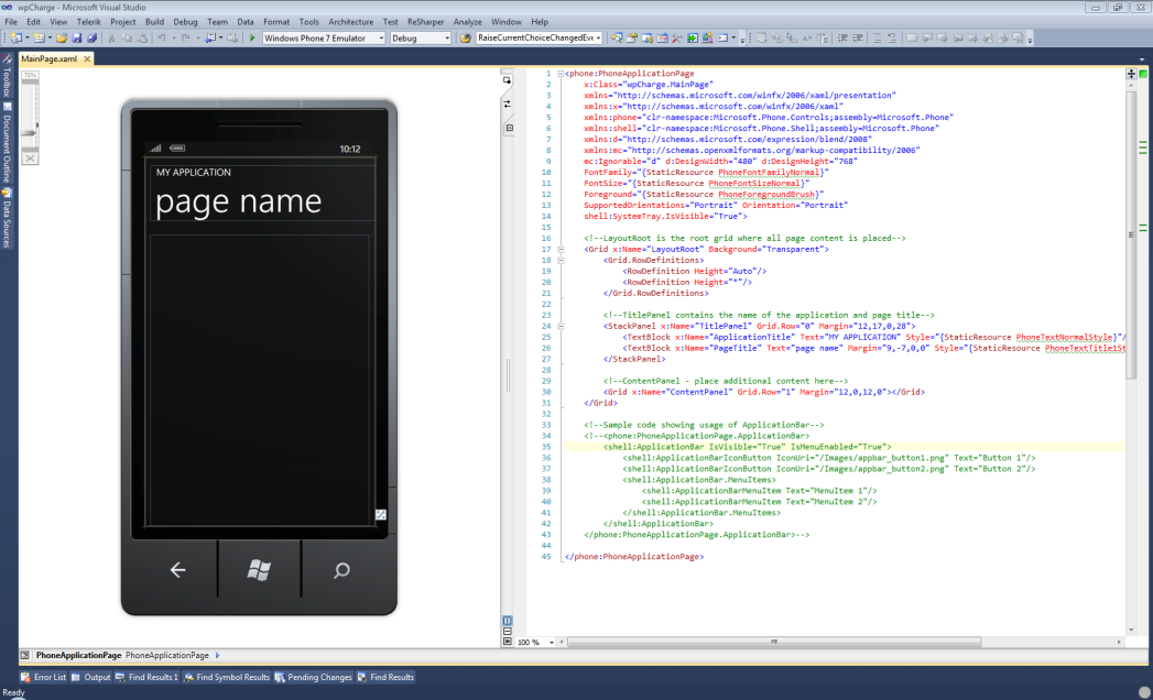
The section of commented code at the bottom of the XAML section is code which controls the application bar and associated menu items.
In the XAML in the PhoneApplicationPage tag, there is an attribute named SupportedOrientations and one called Orientations. These options control the application page rendering as portrait or landscape. If you choose simply Portrait for the SupportedOrientations for your page, then twisting the phone from side to side will have no effect on the page display as it will always be portrait. You can choose between: PortaitAndLandscape, Landscape and Portrait.
To add new pages to your project, right-click on the project and choose Add, then New Item, and pick the appropriate page template from the list presented.
Navigating Between Pages
WP7 uses the Navigation service in System.Windows.Navigation to provide for navigating to pages in the application. Here is the syntax:
NavigationService.Navigate(new Uri("/name.xaml",
UriKind.Relative));
One of the new hardware requirements is the Back key on the lower left side of the phone. Pressing the Back key navigates to the previously selected page and exits the application if you press it from the application’s root page. You can override the OnBackKeyPress method to trap this button press and execute code. The Windows Phone 7 UI Design and Interaction Guide (available from developer.windowsphone.com) contains the warning that “developers should only implement Back key behaviors that navigate back or dismiss context menus or modal dialog boxes. All other implementations are prohibited.”
Application Tombstoning
Your application cannot interfere with any of the standard behaviors of the phone. For instance, your application cannot disable incoming phone calls or turn off GPS, etc. Because WP7 does not support multi-tasking in the first release, your application can be deactivated anytime based on what either the user or phone wishes to accomplish. Pressing any of the hardware buttons or launching another application causes your application to be deactivated. When this happens, if the phone needs more available ram, it will close your application. This behavior is called tombstoning. Application tombstoning will destroy any session data or program state when the program is reactivated or closed.
In the final release bits, the development team added four events to the app.xaml.cs that you need to be aware of. These are: application_launching, application_activated, application_deactivated and application_closing. Place code in these events to handle each of the various states. Once your application is tombstoned, your application has 10 seconds to save application state so that it can be restored if the application is reactivated.
Since an embedded database won’t be available in the first release (although Microsoft SQL Server Compact is on the phone but not reachable), you will have to use isolated storage to save your data (Listing 1).
You should place your code to save data in application_deactivated or application_closing and you should place the code to load data in application_launching or application_activated depending on your requirements. The ability to save application state is also handy if your program requires a connection to a web-service. If your connection is down, you can save the data and retry when you have a valid connection.
Having learned from previous experiences with Windows Mobile versions, the Windows Phone team made the conscious decision to prevent direct access to the underlying operating system. This decision prevents developers from performing potentially dangerous operations, prevents carriers from tweaking phone behavior to disable capabilities, and standardizes both code and access security to phone hardware.
The Sensor API
The built-in sensors are:
- Accelerometer
- Assisted GPS
- Camera
- Compass
- Proximity Sensor
- Light Sensor
Of these sensors, developers can only use and interact with the accelerometer, assisted GPS (AGPS), and the camera. The compass API is not ready yet, and the last two are system sensors. The proximity sensor blackens the screen when held near to an object while in a phone call. The light sensor is used to dim the screen at night.
Listing 2 shows how to use the accelerometer. The AGPS is initialized similarly.
Launchers and Choosers
Launchers are fire and forget tasks. They will not return values to the application:
- BingMaps
- SearchTask
- MarketPlaceLauncher
- MediaPlayerLauncher
- PhoneCallTask
- SaveEmailAccessTask
The snippet shows you how to launch a SearchTask and Figure 8 shows the results of the search.
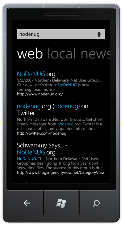
private void btnSearch_Click(object sender,
RoutedEventArgs e)
{
   SearchTask searchTask = new SearchTask();
   searchTask.SearchQuery = "nodenug";
   searchTask.Show();
}
Choosers are tasks which initiate a user interaction and expect something to be returned to the application. These include:
- CameraCaptureTask
- PhoneNumberChooserTask
- PhotoChooserTask
- EmailAddressChooserTask
Listing 3 shows how to initiate a CameraCaptureTask. The other choosers are used the same way, exchanging CameraCaptureTask for the names of the other chooser in the code listing.
Notifications
There are three types of notifications that you as a developer can use. These are:
- Tile notification — This lets you change the main application tile on the Start experience. You can display custom messages, counts of messages, actions available, etc. The tile notification alerts your user that there are actions available.
- Toast notification — This lets you popup a message on the device which displays as an overlay onto the top of the user’s current screen even if your application is not running. There are a few best practices for using toast notifications:
- Toast notifications should be personally relevant and time critical.
- Toast notifications should primarily be focused on peer-to-peer communication.
- Raw notification — This lets you send raw data to the running application which you can receive via an event. This pops up on your application like a MessageBox and has an OK button to close the dialog.
Each of these notifications depends on a cloud service available to developers. If you bind your notifications to tiles and toasts to this cloud service, you can provide a seamless, automatic update.
You can see a great set of tutorials for studying and using notifications at http://channel9.msdn.com/Learn/Courses/WP7TrainingKit.
Conclusion
As you can see, there is great power, flexibility and thoughtful design in WP7. Microsoft has engineered the developer story to encompass the totality of your experience from getting the free tools, writing your first app, posting it to the developer portal, seeing it on the marketplace, and walking your profits to the bank. Microsoft has also developed the infrastructure on the Internet to support those development efforts. The top links for you will be:
- developer.windowsphone.com
- www.silverlight.net/learning
- creators.xna.com
Microsoft listened to its developer community and made great free tools available to everyone who wishes to create advanced apps for the WP7 using Silverlight or XNA. You no longer have any excuse for not creating the next killer app.